
I was asked by Paula Abbandonato of Vibe PR to design a new logo, website and printed promotional materials for her new campaigning charity dedicated to protecting the rights of abused women and girls around the world.
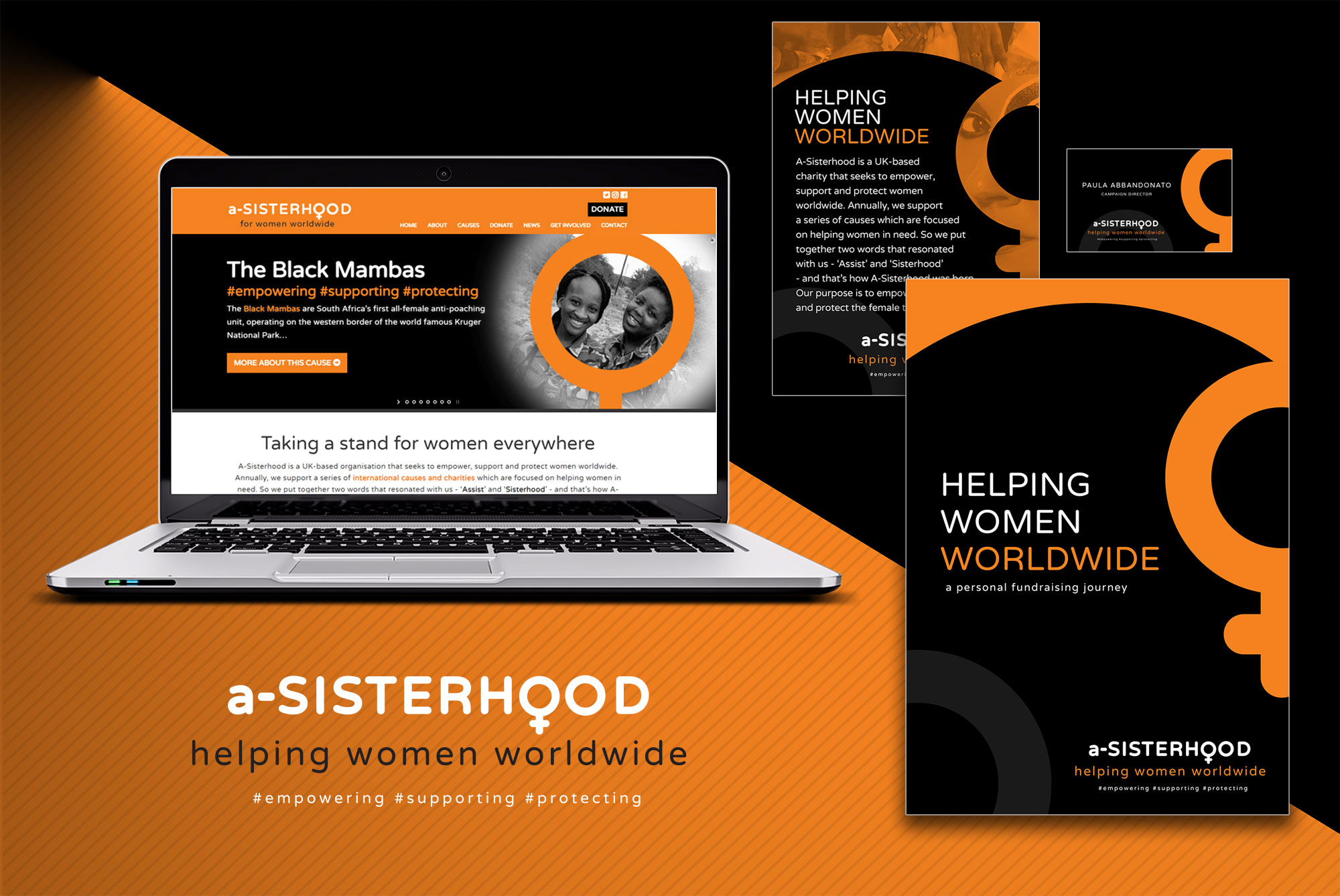
Paula needed a simple but bold and memorable logo and general brand style for the launch and promotion of her charity campaigning to 'empower, support and protect women worldwide'. I devised a no-frills, type-led logo that used a softly curved, sans-serif typeface with the universal symbol for the female gender with a high-contrast black/orange/white colour scheme to communicate both femininity and the stark urgency of the issues being campaigned. I also had the idea of including three single-word hashtags in some versions of the logo tagline to emphasise the three key mission elements of the campaign, and tie this in with Paula's social media work.
Steve captured the brief perfectly and delivered a strong identity for the new organisation. It was important to us to have a powerful brand that could carry well across all marketing collateral and that has definitely been achieved. The website he created on our behalf is engaging as well as functional and has been very well received. We will definitely look to work with Steve for future projects.Carl Elsby, Director, A-Sisterhood